

Monday, May 2, 2011
"footsoccer"
Monday, April 25, 2011
Coke.

Helvetica works though, it's clear, it's concise. The radial gradient is cool too.
Tuesday, April 19, 2011
Activists are a clever bunch.

"The Best Defense is not Offense" is what the caption at the bottom reads. The message of this advertisement is that we don't control the trees, they do what they can for nature and we can't bank on them to reduce the world's CO2 numbers while we continue to reduce their numbers. I think the font is distressed to resemble tree bark, and I think the font used is a condensed version of Folio.
Tuesday, April 12, 2011
Turmepa sounds like Tempura, and now I'm hungry.

This is a rather witty ad from Turmepa, telling us to keep the oceans clean since it'll be invading our lands eventually. Whatthefont says the font in use is Folio.
I think it's effective, the message of the ocean rising is emphasized by the water coming up over the text, I think the bubbles are a little odd but that's kind of irrelevant.
Tuesday, April 5, 2011
No more octomoms.

I believe they used a modified version of Helvetica due to the middle part of the E not extending all the way out, but it is clearly distorted so it's hard to tell. I think it's effective at what it's trying to say because of how obviously tense and crowded the image is.
They also misspelled "too late" at the end of the picture.
Wednesday, March 30, 2011
Skittles.

Tuesday, March 22, 2011
HSBC Investments

Tuesday, March 15, 2011
NY Times advertisement

This is an advertisement for the New York Times' Turkish edition. They have notable landmarks from Manhattan and Istanbul recreated in a typographic manner. It's created in a way that allows the viewer to tour through the two cities. I think it's very well done and creates an awesome effect that really grabs your attention and makes you look deeper into the image. It looks like they've used a few different types of font but it still works well.
Wednesday, March 9, 2011


But he didn't shoot no ITC.

Tuesday, March 1, 2011
"I love you like kings love queens, like a gay geneticist loves designer 'jeans' "

I was looking the dvd up to buy it but when I saw the image I thought it would be perfect for a blog picture. The DVD is called WORDS WORDS WORDS so I think the image is fitting as it is indeed a bunch of words making up his picture. I'm really drawn to text-heavy designs like these because it pulls you in and makes ou look at the image longer, trying to figure out what the words are saying and how small they get.
What the font says the typeface used is "TVNord Condensed" which I haven't heard of before, or Futura Condensed. But I feel as though it is indeed the TV Nord font because of the O. In the title it is flatter on the bottom, the O in Futura is more pointy.
Tuesday, February 22, 2011
Futura Poster
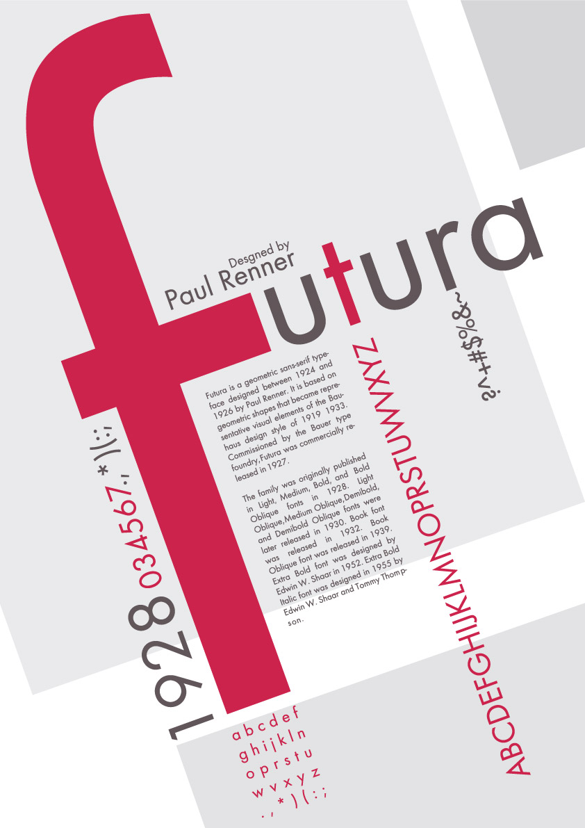
This is a font specimen poster I found on Deviant Art (http://ferdak.deviantart.com/art/futura-afis-122719406). I really like how it's done on a tilted axis. The font is Futura and it is another sans-serif font that I like. The poster serves to identify the font, provide information about it, and showcase every character. The giant pink tilted F is what originally drew me to the picture but the way everything is pieced together makes it interesting as well.
Tuesday, February 15, 2011
Typographic World Map

I found this on a Deviant Art and thought it was an interesting concept. I like how the words vary in size depending on the size of the country and I like the contrast between the black and the tan.
Monday, February 14, 2011
Wordmark Research

I thought this wordmark was very interestingly done as it conveys the message of "flat" well with the shadow.

This wordmark is probably my favorite as it's something so simple yet conveys a very clear message and at least to me, it's hilarious.

This one is cool because the space under the T makes an 11.


The O and the X make the Jesus Fish.
Tuesday, February 8, 2011
Snowmaggedon 2011

This is a PSA (I guess?) for road safety from what I assume is the UKs version of the Department of Transportation. I like how each of the words is a different first aid or safety precaution you should always have with you in your car. I also like how in a kind of abstract way the writing makes the shape of a car. With KIT probably being the grill and FOR maybe being lights or a luggage rack or something.
Wednesday, February 2, 2011
Da Font

This is a business card concept for a DaFont.com employee. I love DaFont and I think the card does an excellent job at showing what they do and what they're all about. The card showcases a bunch of different fonts in the background and what I think is Helvetica on the information part. I like the spacing of the words and I love how they have them going at an angle on the back. I like how the colors and pretty much the same in the background yet they still stick out and are easily readable while not taking away from the image.
Tuesday, January 25, 2011
Text messaging while driving prevents you from seeing what really matters

I think this ad is awesome and does a great job at illustrating its point. found it when I was looking for typography inspiration on a blog compiling a list of interesting advertisements. I love the style of the writing too, how it all fits in together and how the words vary in size. It's kind of a good inspiration for my font specimen poster as well.
What the Font had a seizure when I tried to upload this image due to the amount of characters, so I couldn't get a font name from them, but I think it's Helvetica. I tend to gravitate towards sans-serif fonts as serifs seem old, and old things scare me.
What the Font had a seizure when I tried to upload this image due to the amount of characters, so I couldn't get a font name from them, but I think it's Helvetica. I tend to gravitate towards sans-serif fonts as serifs seem old, and old things scare me.
Wednesday, January 19, 2011
ITC Avant Garde

"Love is the Movement"

What the font couldn't figure out what the typeface was but I think it's Avant Garde due to the A in "arms". I like the font style though as I'm a fan of sans serif fonts. I think this logo works very well to identify the organization because it is instantly recognizable on all of their products. I like the kerning on the letters as well although I think the alternative character on the "A" at the bottom was a bit pointless.
Wednesday, January 12, 2011
Cigarette butts count as litter, too.

I saw this while I was googling information on smoking to win a pointless debate with a friend and, as I have a hard time taking anything serious seriously, I thought it was funny in a nerdy way. It's a great play on words because if you understand that the boldness of a character is described as its weight, you get the decreasing font weight throughout the sentence, it's still effective if you don't though because you still understand that the words are becoming "skinnier" while you read something about reducing body weight.
WhatTheFont tells me it's an Avenir font though it's not sure whether it's Avenir Book or Avenir Medium. I enjoy this font and I've used it before on flyers because I believe it to be very modern looking and clean, which is what made me notice it in the first place. It's a sans serif font and though serifs are supposed to guide our eyes, I find them to be a distraction and that using them would have taken away from the effectiveness of this clean cut advertisement. The typography is great, it stands out, it's kerned nicely and fills an adequate portion of the ad space. I like how the "(one lung at a time)" bit is placed under the word "WEIGHT" to sort of balance out the boldness at the beginning of the sentence.
Boring Introduction.
Hey there. This will be my blog for my Typography I class, which you already know because let's face it, unless you've been assigned to read this, you're not going to be reading this. This is the first actual design based class I've ever taken and I am very excited. I became interested in design in 2005 when a friend's band needed a layout done for their MySpace (back when it was still cool). I had just learned to use <big> <small> and the strikethrough tag and displayed it hideously all over my MySpace page, which is why they thought I was qualified to create an entire layout with working code I guess. Obviously, I had absolutely no idea what I was doing but neither did they so they thought I was a genius and it worked out great. Eventually I taught myself how to actually code, use Adobe products, and make things I'm not completely embarrassed by now, but I still don't know the core values of design so I'm very excited to learn.
Subscribe to:
Posts (Atom)