Tuesday, February 22, 2011

Futura Poster


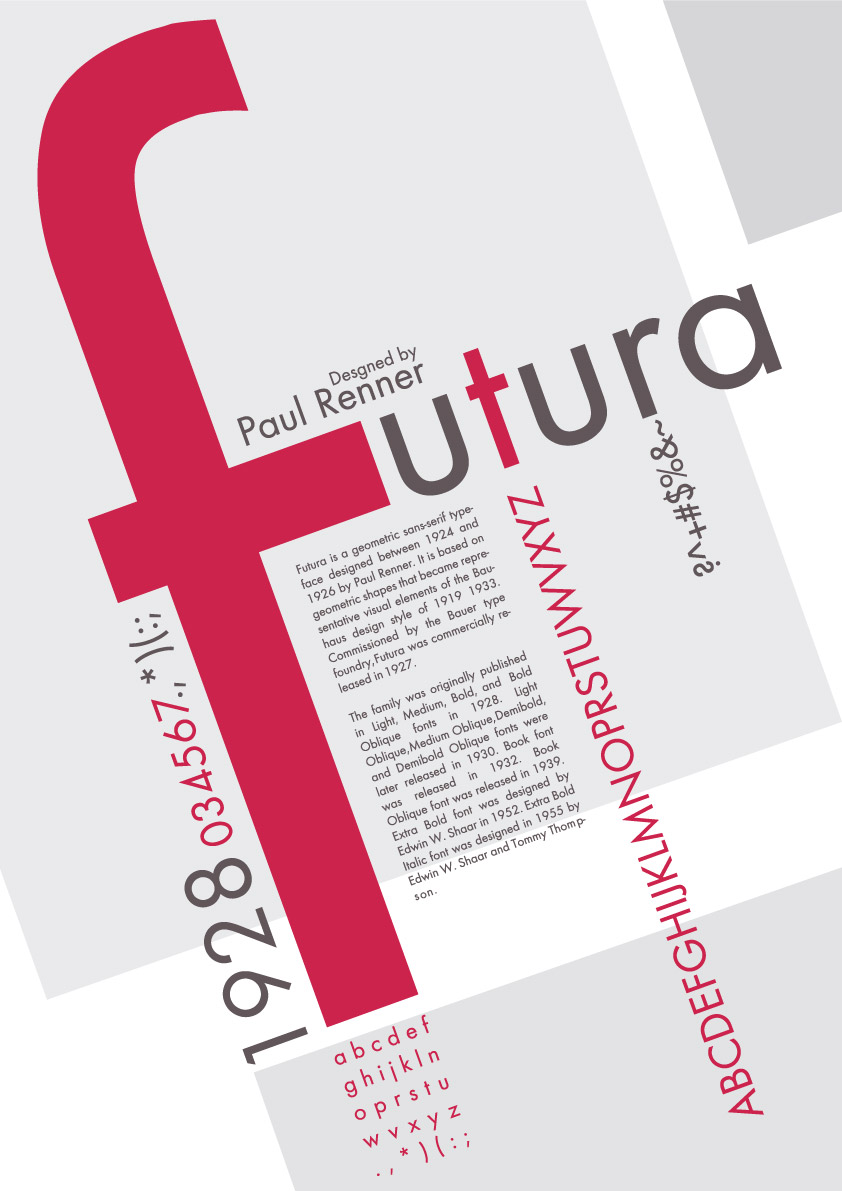
This is a font specimen poster I found on Deviant Art (http://ferdak.deviantart.com/art/futura-afis-122719406). I really like how it's done on a tilted axis. The font is Futura and it is another sans-serif font that I like. The poster serves to identify the font, provide information about it, and showcase every character. The giant pink tilted F is what originally drew me to the picture but the way everything is pieced together makes it interesting as well.

Tuesday, February 15, 2011

Typographic World Map


I found this on a Deviant Art and thought it was an interesting concept. I like how the words vary in size depending on the size of the country and I like the contrast between the black and the tan.

Monday, February 14, 2011

Wordmark Research


I thought this wordmark was very interestingly done as it conveys the message of "flat" well with the shadow.

This is a very simple wordmark and it's so subtle that you don't really notice it, but once you do it's the first thing you see when you look at it. The space between the E and the x make an arrow.


This wordmark is probably my favorite as it's something so simple yet conveys a very clear message and at least to me, it's hilarious.

This is another interesting wordmark, I like how it looks like different letters but it's all an 8.


This one is cool because the space under the T makes an 11.

 This is the logo of the Hartford Whalers. I think it's cool because there is an H inside of the W.


The O and the X make the Jesus Fish.

Tuesday, February 8, 2011

Snowmaggedon 2011


This is a PSA (I guess?) for road safety from what I assume is the UKs version of the Department of Transportation. I like how each of the words is a different first aid or safety precaution you should always have with you in your car. I also like how in a kind of abstract way the writing makes the shape of a car. With KIT probably being the grill and FOR maybe being lights or a luggage rack or something.

Wednesday, February 2, 2011

Da Font


This is a business card concept for a DaFont.com employee. I love DaFont and I think the card does an excellent job at showing what they do and what they're all about. The card showcases a bunch of different fonts in the background and what I think is Helvetica on the information part. I like the spacing of the words and I love how they have them going at an angle on the back. I like how the colors  and pretty much the same in the background yet they still stick out and are easily readable while not taking away from the image.

Tuesday, January 25, 2011

Text messaging while driving prevents you from seeing what really matters

I think this ad is awesome and does a great job at illustrating its point. found it when I was looking for typography inspiration on a blog compiling a list of interesting advertisements. I love the style of the writing too, how it all fits in together and how the words vary in size. It's kind of a good inspiration for my font specimen poster as well.

What the Font had a seizure when I tried to upload this image due to the amount of characters, so I couldn't get a font name from them, but I think it's Helvetica. I tend to gravitate towards sans-serif fonts as serifs seem old, and old things scare me.

Wednesday, January 19, 2011

ITC Avant Garde

Herb Lubalin was one of the most prominent graphic designers of the 60s and 70s, it's fitting then that he would go on to create one of the most widely abused typefaces in the world, Avant Garde. Originally created just to serve as an instantly recognizable, futuristic logo for the Avant Garde magazine, a full-fledged typeface eventually came out due to so many requests for it in 1970. It was released through Lubalin, Burns & Co. which later became known as the ITC. Most of the creators of Avant Garde agree that nobody really understood the point of it are quoted as saying "The only place Avant Garde looks good is in the words Avant Garde".